This site was built using Claude Code, but the case study and all thoughts expressed here are entirely mine.
Chase Simply: making personal finance less overwhelming
An AI-powered budgeting feature redesign for the Chase mobile app, built from 53 user survey responses to bring clarity to everyday financial decisions.
Lead Designer (Team of 4)
Fellowship Project
AI feature concept, design, survey
Figma
Overview
The problem with current financial features
Chase already has budgeting tools, however our research shows that they are largely unused. Our survey of 53 users revealed that existing features like categorized spending were going largely untouched, not because users didn't care about their finances, but because the experience felt impersonal and hard to navigate.
Our solution: a new "Plan & Track" tab anchored by a guided questionnaire, custom spreadsheet tool, and an AI assistant called Simply. These features intend to make financial clarity feel approachable for users beginning their financial journey, increasing trust as they bank with Chase.
53
Survey respondents
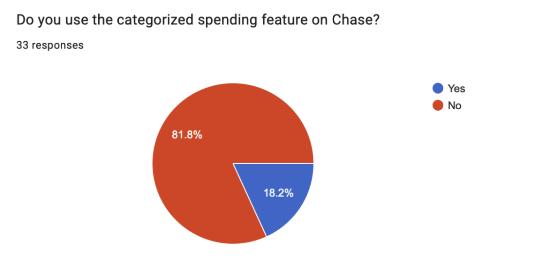
81.8%
Don't use Chase spending categories
4
Team members
Research
What 53 users told us about money
We designed a survey targeting Chase users to understand their real financial behaviors like what they spend on, how they track it, and where the app was falling short. We chose surveys to reach a large number of people efficiently and generate both quantitative patterns and open-ended qualitative feedback.
Built to empathize with young users who are new to independent financial management
Qualitative Usability Testing
Open-ended feedback sessions to understand how real users interact with financial features
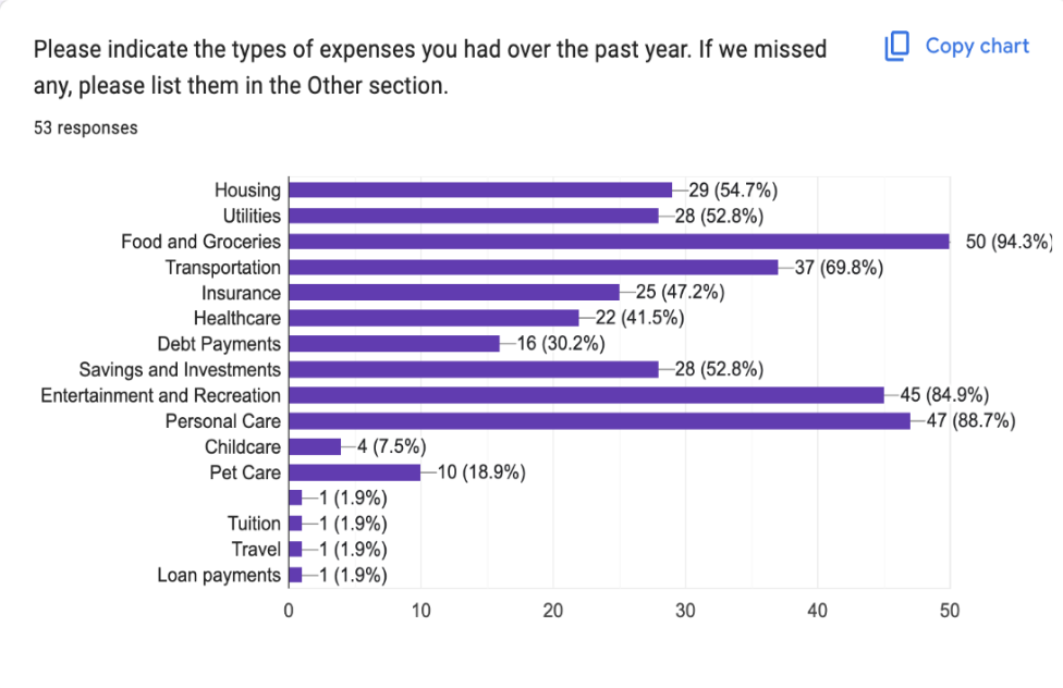
We focused on three key research questions: what expenses people actually have, what tools they use to budget outside the app, and whether they were engaging with Chase's existing visualization and categorization features.
Top expenses: food & groceries (94.3%), personal care (88.7%), entertainment (84.9%). Most common budgeting tool: nothing external (39.6%).
81.8% don't use Chase's categorized spending feature. 61.8% don't use spending visualization tools despite Chase offering both.
Key User Quote
"Categories are not personalized. Some transactions are bucketed in the wrong spot and there's no obvious way to adjust the bucket and prevent future errors."
Users weren't avoiding financial planning; they were really avoiding an interface that didn't feel built for them.
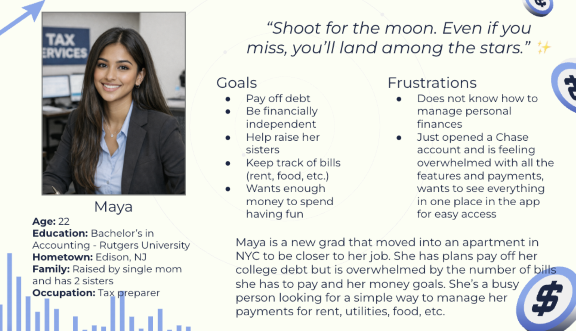
Meet our user persona, Maya
We chose a young persona because younger people are more open to using AI to augment their financial journey. Maya represents the overwhelmed-but-motivated first-time Chase user our design needed to serve.
Maya, 22 is a new grad navigating debt, bills, and financial independence for the first time. She hates how complicated finances have gotten.
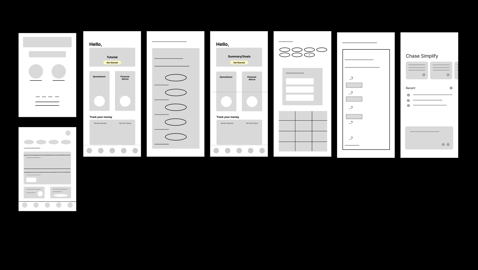
Sketches & Wireframing
Figuring out what goes where first
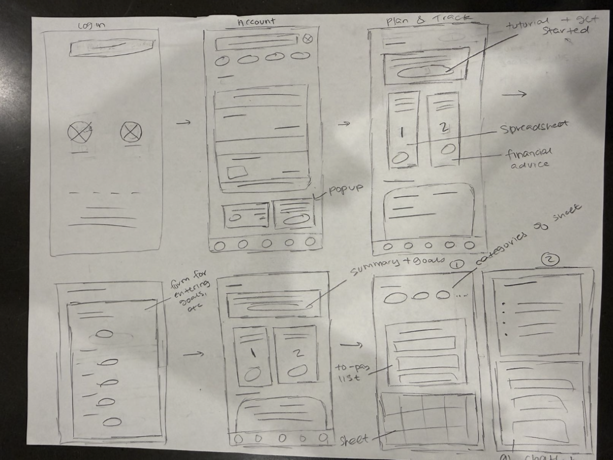
Our first step was determining an entirely new layout and organization of the preexisting tab "Plan & Track." Since we were designing from scratch rather than redesigning an existing screen, the wireframing phase was essential for aligning the team on structure before touching any visual details.
Early sketches mapping out the log-in flow, account view, plan & track tab, and the relationship between the spreadsheet and financial advice features.
Lo-fi wireframes showing the reorganized spending and budgeting screen: before and after states for a user who has/hasn't completed their financial goals questionnaire.
Design Process Note
Our research with over 50 respondents highlighted the inefficiency of Chase's existing budgeting features. The solution needed to do two things at once: reduce friction for new users through a guided onboarding path, and give power users a more capable toolkit for ongoing financial management.
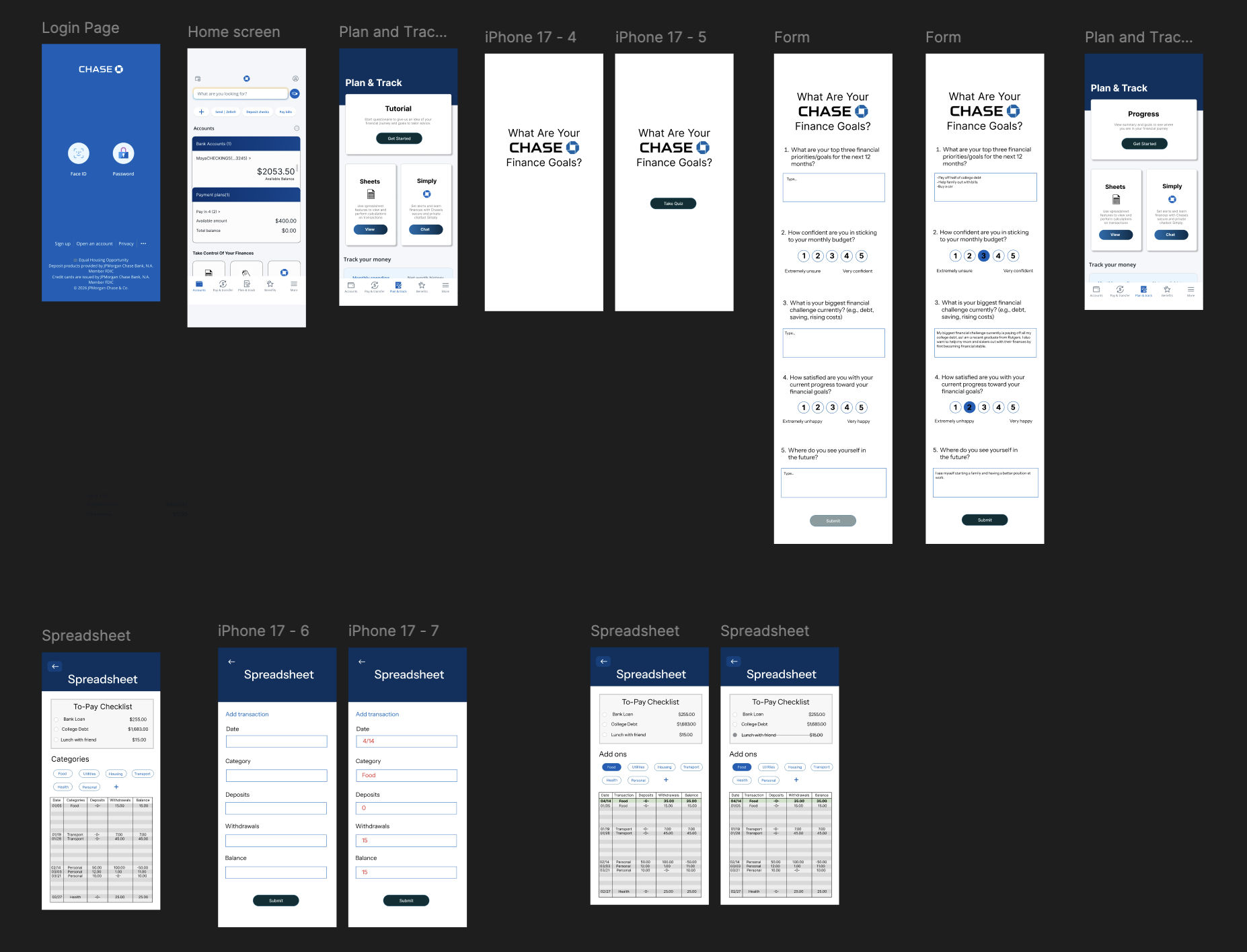
High-Fidelity Design
Four simple financial help features
The final design introduces a new "Plan & Track" tab built around four interconnected features which all designed to meet users at whatever level of financial literacy they're starting from.
Hi-fi screens: the Chase Finance Goals questionnaire, the Spreadsheet with To-Pay checklist and category management, and Chase Simply the AI financial assistant.
01
Financial Goals Questionnaire
An onboarding questionnaire that asks users about their financial priorities, confidence levels, and biggest challenges. This data personalizes the AI's advice throughout their journey and gives users a benchmark to reflect back on in their Summary/Goals view.
PersonalizationGuided onboardingAI input
02
Spreadsheet with Category Management
A custom budgeting spreadsheet with a to-pay checklist for outstanding bills and fully editable spending categories. Directly addresses the core user pain point of transactions bucketed incorrectly with no way to fix them.
Bill trackingCustom categoriesFinancial organization
03
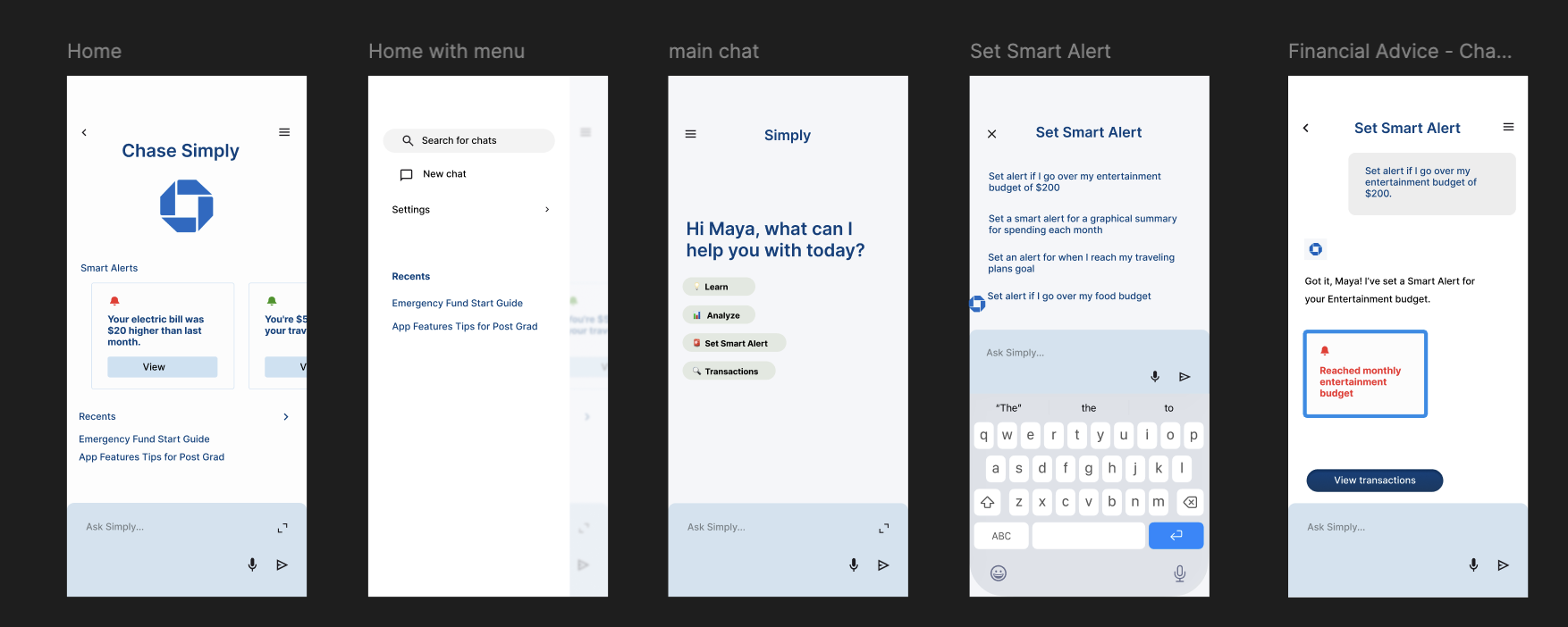
Chase Simply: AI Financial Assistant
An AI chatbot called Simply that answers financial questions, surfaces relevant Chase features users didn't know existed, and sends smart alerts (like noticing when your electric bill is unusually high). This was the feature I came up with and led the design on, incorporating AI to asking for financial help feel more human.
AI chatbotSmart alertsFeature discovery
04
Guided Tutorial & Summary/Goals
A step-by-step guided tutorial for first-time users, and a persistent Summary/Goals view that helps users track progress toward the financial goals they set in the questionnaire. Designed to make the app feel like it's growing with you.
Habit formationProgress trackingGamification
Outcomes
What this project produced
Core Contribution
Conceptualized and designed the Simply AI feature: the centerpiece of the redesign that ties personalization, alerts, and feature discovery into one conversational interface.
Research Impact
Survey data from 53 users revealed that Chase's existing features had very low adoption since the design was not reflecting user needs.
Team Leadership
As the most Figma-experienced designer on the team, I led the technical execution and kept the project on pace: teaching autolayout, animations, and project management as we went.
Lessons learned
1. Quality over quantity in iteration
We ran into problems chasing design quality too fast. The spreadsheet screen required a full redo after getting different opinions from team members which ultimately led to a better result, but reinforced the value of aligning early on visual direction before building.
2. Minimalism is a constraint, not a default
Keeping the design minimal was a deliberate decision since financial tools can easily become overwhelming. Restraint in the UI was a way of honoring the users who told us the existing experience already felt like too much.
3. Leading a team sharpens your own skills
Having to explain Figma's autolayout and animation features to teammates forced me to understand them more deeply myself. Teaching is one of the best ways to solidify a skill.