This site was built using Claude Code, but the case study and all thoughts expressed here are entirely mine.
Making progress visible in a compassion practice app
Using survey feedback from 390+ participants to design premium features that let users track and reflect on their emotional journey toward a more positive mental state.
Solo UX Designer
Work Project
Figma
Lab Director & Post Doc
Overview
Turning 390 voices into a feature direction
Using survey feedback from over 390 participants, I noticed a gap between users practicing and their post-reflection: they were doing the work but couldn't see the growth. The redesign focused on generating premium features that let users track and reflect on their journey over time.
This was a two-part redesign: reducing friction at the entry point, and making personal data visible and meaningful throughout the experience.
390+
Survey participants
2
Core redesign features
2027
Projected premium launch
Research
Understanding the users before designing for them
The Lab Director and Post Doc provided de-identified survey data from hundreds of real users which was extremeful helpful. I paired this quantitative foundation with qualitative methods to build genuine empathy before touching any UI.
Stakeholder Interviews
Aligned with the Lab Director and Post Doc on goals, constraints, and existing research
390+ Participant Survey
Quantitative & qualitative data provided by the lab — the primary insight source
Competitive Analysis
Identified feature patterns in comparable apps to inspire without losing product identity
Key User Insight
Multiple users expressed how limited the interface felt and described not feeling any changes over the duration they used the app, despite putting in the practice.
Users were providing rich emotional data during every session. We needed to aid users in seeing a trend of wellbeing through their journey.
In the qualitative open-response questions, a recurring theme emerged: the app felt like a one-way street. People were doing the practices, recording their feelings, and selecting intentions, but that data disappeared. There was no visible arc of growth.
This became the problem statement: reduce friction at the entry point and make progress visible through a feedback loop built on the data users already generate.
Sketches & Wireframing
Mapping the structure before design
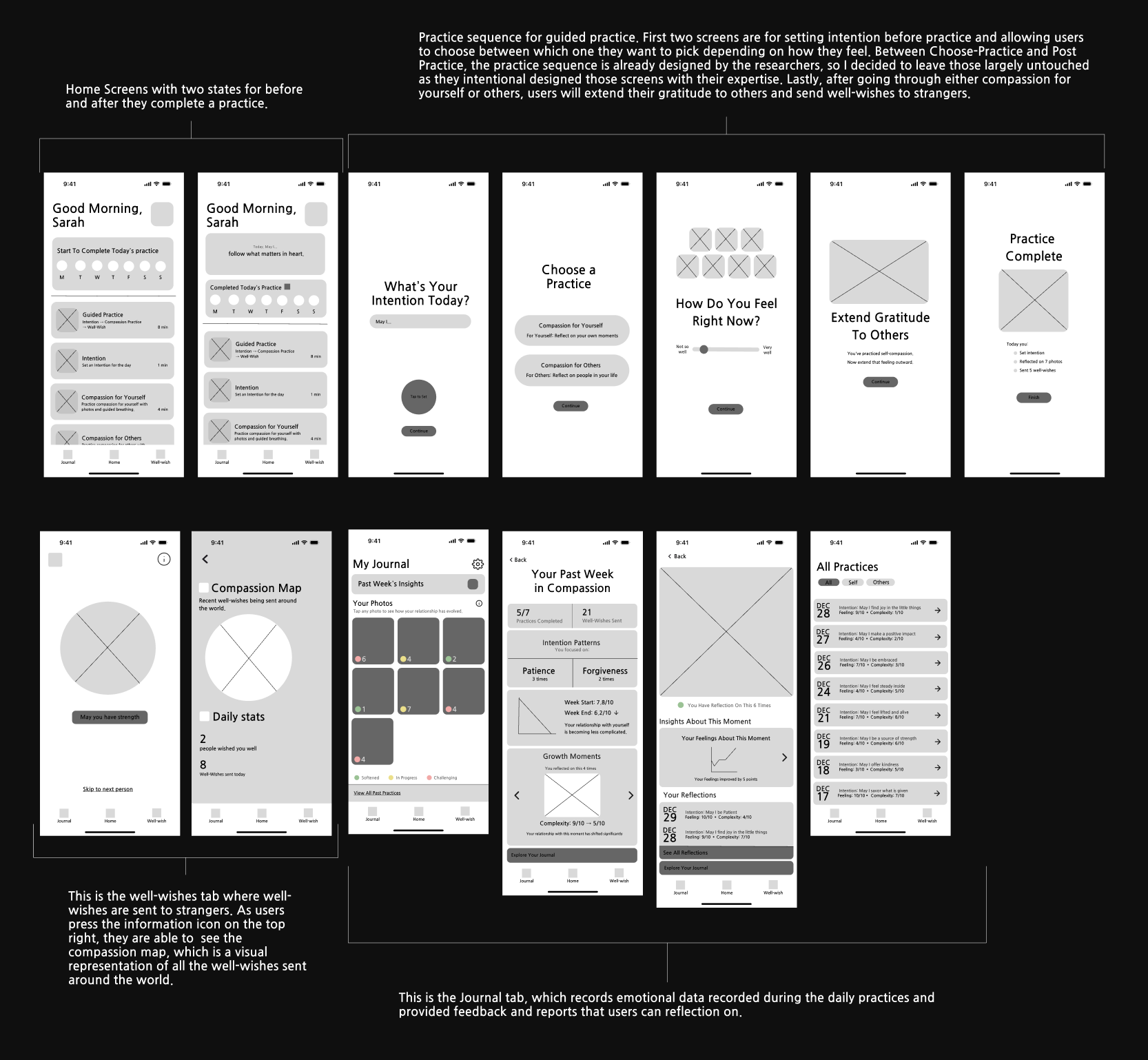
The wireframing phase was one of the most challenging parts of the project, figuring out which features to build on top of an existing system without disrupting its research integrity. The practice sequence designed by the researchers was left largely untouched by intent; the redesign focused on the entry point and the data layer around it.
Low-fidelity wireframes: home screen states, guided practice sequence, well-wishes tab, journal, and all practices view.
Design Challenge
The practice sequence between Choose-Practice and Post-Practice was already intentionally designed by the researchers. The challenge was building on top of that experience without interfering with it.
High-Fidelity Design
Two solutions. One feedback loop.
The final design addresses both ends of the experience: how users begin a practice, and what they walk away with over time.
01
The Guided Home Screen
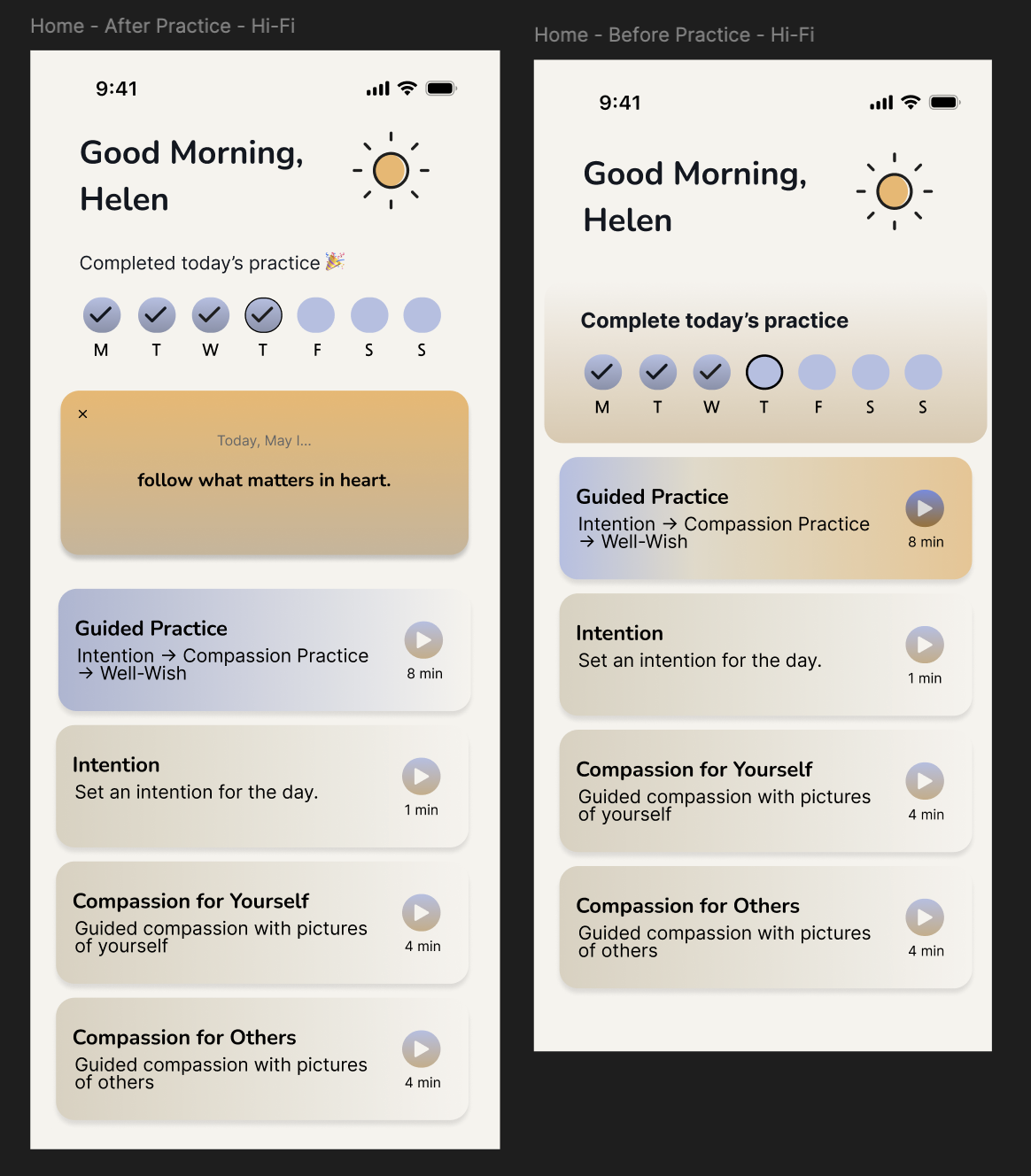
Redesigned the landing experience to remove decision fatigue. Instead of wondering where to start, users are met with a guided path featuring a single prominent card that makes the habit-forming process feel effortless. After completing a practice, the screen state shifts to show the day's intention and a streak tracker.
Habit formationReduced frictionBefore / after states
Left: Home screen before completing today's practice. Right: Home screen after completion, showing the day's intention and streak.
02
The Meaningful Data Suite
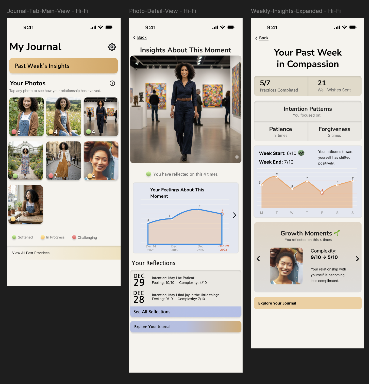
Three interconnected features that make user data visible. This was the idea I was most proud of: mood tracking and session data saved so users can look back on their practices and see actual change over time.
My Journal TabWeekly InsightsPhoto Growth Gallery
Left: My Journal Tab is central display for past practices and growth data. Center: Weekly Insights is data-driven reflection with intention patterns and emotional tracking. Right: Photo Growth Gallery lets you tap any photo to see emotional history and insights associated with that person.
Technical Challenge
This was my first time using Figma, which created real challenges in achieving the professional polish I was aiming for. I worked to maintain the original app's color scheme while shifting to a white background with navy-black text for better readability. Many attempts were made before the UI felt cohesive.
Outcomes
What came out of this project
Impact
Presented to the Lab Director and Post Doc, who provided feedback and began planning based on the work. A premium version is projected for the first half of 2027, with these proposed features taken into consideration.
Core Contribution
Synthesized insights from 390+ survey responses into a cohesive problem and a two-part design solution. Regardless of what the final product implementation looks like, the insight work was still critical for future updates.
Most Proud Of
The mood tracking and data-saving concept which was the idea that users should be able to look back and see their emotional journey reflected in the very photos they practiced with.
Lessons learned
1. Research is as important, if not more than the design
The outcome wasn't just the UI, but also it was the synthesis work connecting user voices to a clear problem. That work holds value regardless of how the final product evolves.
2. Working within an existing system is its own design skill
The hardest constraint was the practice sequence I couldn't touch. Learning to design around a fixed constraint shaped how I think about redesigns generally.
3. Mental health products demand extra empathy infrastructure
With de-identified data and no ability to talk directly to users, other methods were important to designing with real care for the people on the other end.
4. Learning Figma mid-project sharpened my eye for polish
The technical challenge of learning the tool while designing in it forced me to develop a more deliberate sense of what "clean" and "professional" actually means in practice.