Deepening Chase Customer-Bank Relationships by Providing Personalized Financial Management

We reorganized Plan and Track feature in Chases's Mobile Banking App as a mock project, creating a prototype with three features: personalization onboarding, spreadsheet, and an AI called Chase Simply.

Project Overview

  • Role: Lead Designer

  • Duration: 4 months 

  • Tools: Figma, Google Forms

  • Team: 4 Designers

  • Form: Phone App

Background

This project was a mock design project for Chase under the Blueprint fellowship which gets the Rutgers product community together to work teams to create design solutions. We designed a feature within the Chase Mobile Banking app which is a digital banking tool where you can check account balances, deposit checks, and transfer money. 

Problem

Users largely leave the budgeting tools available on the Chase app unused. This problem is especially important to users who  may have been employed and managing complicated finances. Though this is not a usability problem, this creates an opportunity for the Chase App to introduce features that can not only help users feel more confident in their financial journey, but also build long-term rapport with them. This in term helps to increase customer loyalty and cross-sell financial products.

Our Roles 

The team included 3 other designers. We proposed a guided tutorial to approach introducing financial management features within the app. We created a prototype delving into three features: personalization onboarding, spreadsheet, and an AI called Chase Simply. One of my team members introduced the idea of a spreadsheet tracking feature because users were familiar with tools like Excel spreadsheets according to our survey. I was responsible for creating the AI feature that would allow users to use natural language to set alerts on spending. The AI called Chase simply intended to reduce friction of using cumbersome features and to create a feel of a financial helper within the app. We also created a quiz to gauge where people are in their financial journey that would provide personalization to each of these features. During the design process, I also provided mentorship to other designers on my team learning Figma for the first time and understanding the research to design process. I also delegated tasks to my teammates depending on their strength and comfort with the design software.

Research

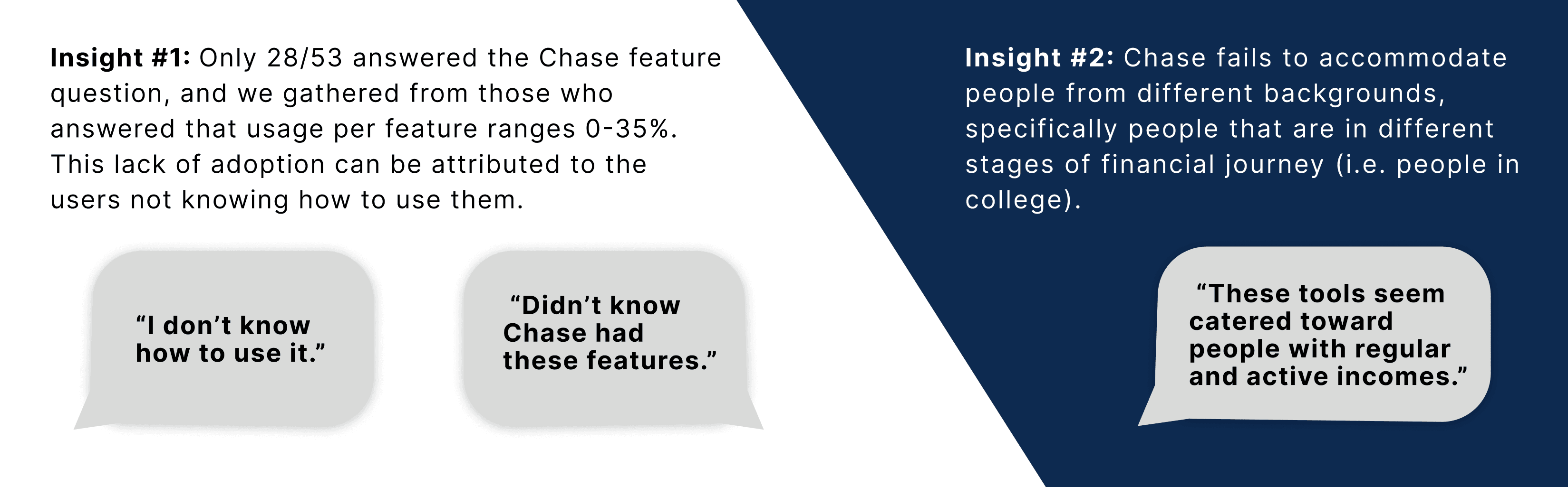
In order for the project to kick off, we collaborated on creating and sending out a Google Forms survey to users of financial banks to better understand the user base. We created a questionnaire asking a range of questions including how they manage their finances, what online tools they use, and their usage of Chase Mobile Banking app if applicable. Receiving 53 responses gave us a sufficient amount of information to create a user persona to better empathize with our users and uncover the opportunity. In the quiz we discovered that 81.8% percent of Chase users did not use categorized spending features and 61.8% did not use the spending visualization tools despite Chase offering both. One user in the open-end response states, “Categories are not personalized. Some transactions are bucketed in the wrong spot and there’s no way to adjust the bucket and prevent future errors.” These insights all point to the idea of the underutilization of these features due to lack of personalization and the friction when attempting to use these features. 


Forms response chart. Question title: Do you use the categorized spending feature on Chase?. Number of responses: 33 responses.

Our research shows that 81.8% of Chase users (subset of the 53 responses) did not use the categorized spending feature on Chase.


Forms response chart. Question title: Do you use spending visualization features (viewing 6 months of history data, bar charts that compare income vs spending, etc.)?. Number of responses: 34 responses.

Our research shows that most Chase users didn't use the spending visualization features.


While this tool was directed at everyone, we chose young adults as our target audience since they were likely to be more open to incorporating technology like AI and data visualization in their financial management system. This information allowed us to brainstorm ideas of personalized financial features using a quiz, AI, and spreadsheet tools to better give freedom to the users to use tools that meet them where they are.

This is Maya our user who is overwhelmed by finances, a potential user we intend to target with our financial management tab.


Process  

The steps that were taken to move towards our final solution was a three step process to better refine our features. We wanted to clarify our ideas on paper to better understand how we can prioritize and structure our features. Each of us refined a different feature, mine being Chase Simply (AI). Our next step we took was to refine our layout on Figma using low-fidelity wireframes. After we came to understand the flow and structure through the wireframing process, we made high fidelity wireframes to add the branding touch and turned them into prototypes.  


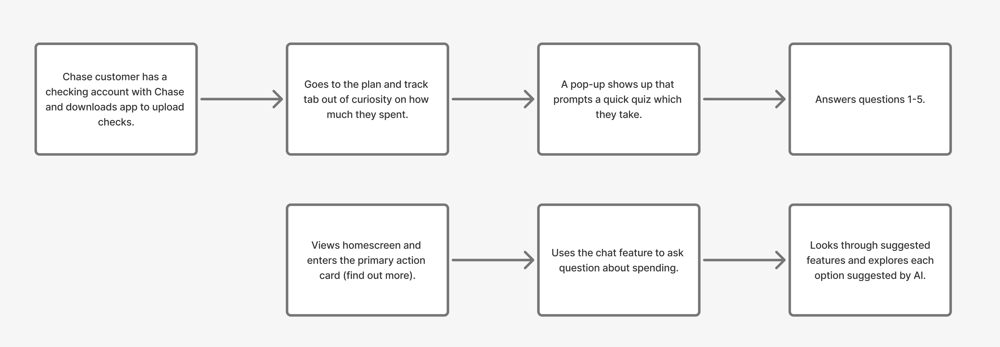
The flow diagram was made to make sense of how the users would go about navigating the financial features within our tab.


This was the initial brainstorming to figure out the layout of all the features. Everything largely stayed the same except the bottom right which was going to be our financial advice section but decided to change it to Chase Simply AI.


My group member made this wireframe for the home tab of the Spend and Track tab.


This was the wireframing stage for the AI feature (initially called Chase Simplify). I made a section for alerts, recent chats, and the chatbox.


Solution

Our final solution became an overhaul of the Spending and Tracking tab. We created a personalized onboarding questionnaire to better understand the user’s financial situation and priorities. This later turns into personalized insights that users can reflect on in the Progress view (was not developed due to time constraints). Another person on my team created the spreadsheet feature where users can filter through transactions and edit a checklist of people to pay. Chase Simply became an AI assistant that can answer basic financial questions and point to relevant features/resources within the app. For example, if users wanted to understand credit cards because they were getting on for the first time, the AI chatbot can be trained to give out information relevant to the Chase Freedom Rise. 


This was a simple flow for Chase Simply AI


This was the financial layout showing how putting in an input would enable Chase Simply AI to give the relevant information.


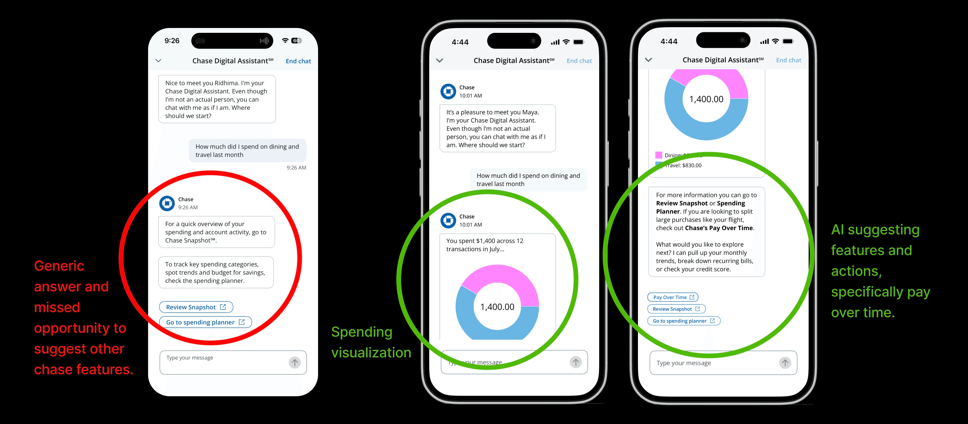
To make the Chase simply more intuitive to use, I used the same design patterns used in Gemini so that there is no confusion about how the chat works and the alerts feel more intuitive. This chat feature allows for typing, gives suggestions, and allows voice to text commands. In addition, one powerful feature is that the Chase Simply can be an agent that tracks certain alerts the user can send (like setting alerts for transactions over 100). This is a feature that cuts back time searching through the app and keeps banking more secure as users can naturally set up security alerts. Chase simply abstracts away the complications of personal finance and gives direct access to personal finance features rather than tapping through menus, screens, and buttons. This means the user does not have to take an extra step to learn where buttons, icons, or settings are. Chase simply understands what you mean right away lowering barriers to financial management. 


This was the smart alert where users can use natural language to set alerts and view them.


Since this was a mock project we were not able to implement and see this feature come to life in real life. What we did have was a prototype built on real insights from 53 responses of people across all ages. 


Lessons Learned

While my team had never touched Figma, they had amazing ideas and my role as someone with a bit more experience was to be the voice that had to be reasonable in terms of what can be done within the short time frame we had. We initially wanted to also include a more comprehensive guided tutorial for finance and a delay function where we can have pop-ups that ask the user what transaction they are making and if they would like to go through. For the interest of time and complication, I came up with the AI feature that solved those problems in one feature like setting up an alert and giving freedom for users to ask whatever questions depending on where they are in their financial journey. This allowed us a good amount of time to refine the simple three features we had and gave each other feedback to improve upon the design. We did user testing with a couple of users who felt that the quiz and AI features were really useful. Some were a bit confused with the Checklist feature within the spreadsheet tool. If we had more time we would have refined the spreadsheet feature with actual usability testing. 


Helped my team member by giving feedback to tweak certain things. For the quiz, I recommended adding a homepage and some input on formatting for the form.


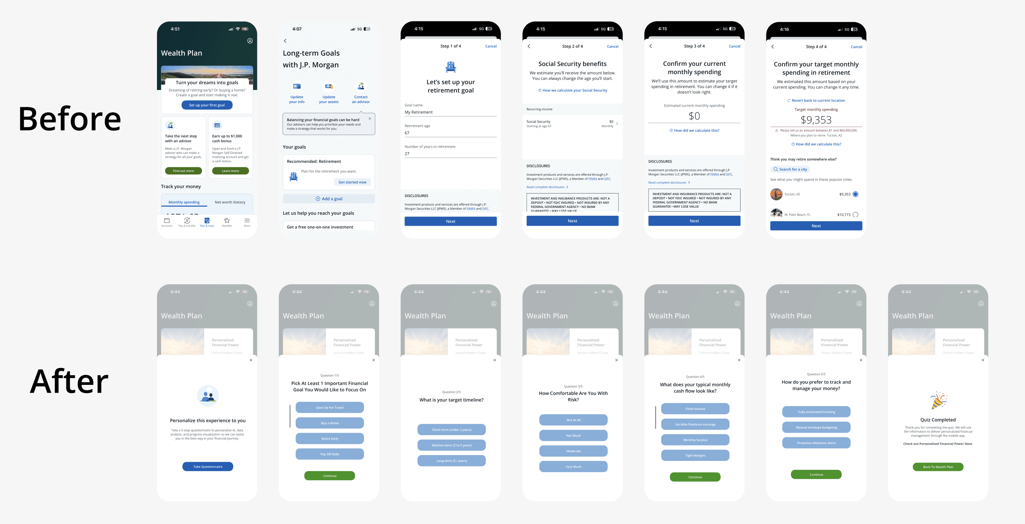
This is the before and after state for the plan and track tab based on whether the quiz was taken or not.


Overall this was my favorite project so far to work on because I was proud of how we all came up with this together. I realized that working in a team you can come up with more incredible designs, seeing solutions you would have otherwise missed if you were working on your own. This was my first time working in a team of four designers and we had differences along the way about how we wanted the features to look like. Ultimately, it was going back to the user research that really helped us rather than trying to design for our own personal taste. This also helped me step up to a leadership role, trying to understand where my teammates ideas came from and helping my teammates frame the problem clearly so that they could improve their design ideas. It was satisfying to see what we created together at the end which culminated in a presentation of our final product to other peers in the Blueprint Organization. 

CLICK HERE TO VIEW PROTOTYPE