🗓️
2025
Increasing Trust in Rare Beauty Online Makeup Site with Personalized Virtual Features.
In this personal project, my partner and I developed a makeup virtual service for Rare Beauty for customers to find their perfect makeup shade.

Project Overview
Role: Co-Designer
Duration: 3 months
Tools: Figma, Google Forms
Team: 2 Designers
Form: Web App
Background
This was a personal project in a team of two designers where we were both equally involved in research and design. We chose Rare Beauty as the brand targeting its users and the beauty community. Rare Beauty sells makeup such as concealer and foundation online. They currently provide a 3 step questionnaire to give shoppers their best match
Problem
Currently users do not feel confident making purchases in makeup e-commerce sites due to the lack of personalization in terms of understanding nuances across the various skins and shades. Our focus was especially young adults who shop online for makeup. Their pain points included lack of features and guidance. This is crucial to users’ trust and confidence in the product since getting the wrong shade could deter them from purchasing a product from Rare Beauty again.

User persona
My partner was another designer. As a two-person team we created surveys to send out to people, analyzed the findings, and brainstormed through the process to agree on the features we wanted. For the design part, my role was to develop the Homepage while my partner made the quiz as she had more experience with makeup education. We both developed the community features iterating on each other’s feedback.

User flow where users choose between the dupe search and shade quiz

Low fidelity wireframe where we brainstormed how the results page would look like emphasizing community validation.
Insights from Research
Before we kicked off the design process, we sent out a Google Forms survey that had 13 respondents, creating a user persona based off of that. Specifically, we uncovered that around 12 out of 13 of users cited “My Undertone” as the hardest part of choosing their shade online. Therefore, my partner added undertone education to the quiz. Moreover, 10 out of 13 of the respondents described current online tools as “Hit or Miss,” leading to a preference for in-person shopping due to trust. One user expressed a desire to “cross-match across brands since [she] was a regular shopper of makeup and didn’t need to take another 5 minute quiz to waste her time.” While this directly challenged our assumption that people wanted a long elaborate quiz, it directly informed my creation of the dupe search finder. We also did a competitive analysis to see how other makeup brands structured their virtual shade services to be aware of certain design conventions or norms. This research informed my partner’s design of the quiz similar to other quizzes since we decided that we did not want to detract too much from the format to prevent user friction.

12/13 users cited undertone as a barrier to choosing a shade online

Majority of users demonstrated lack of distrust in virtual services
To move towards our solution, we took some features we thought our competitor did really well and brainstormed on paper quickly to see how the layout would look . For instance, Saie Beauty did a great job of offering over 30 shade representations while Haus labs prioritized education and minimal UI to build credibility. We also considered putting an AR/VR feature but we felt this was not enough to make the users trust the results. We prioritized building a community validation feature instead since users are more likely to trust other users' opinions rather than a virtual feature. My partner built the quiz, while I worked on the Homepage and majority of the community validation design.

Low-fidelity wireframes developed on Figma addressing undertone education.
Solution

Home page of the virtual services showing the two flows made in user flow diagram
The final product was two different user flows designed based on your experience with makeup. First was for the experienced makeup shopper who wants to save time inputting preexisting shades into a search bar to get an instant match. I came up with this idea because it allowed users to input shades from already owned brands.

Final results page made according to Rare Beauty's brand colors and conventions.
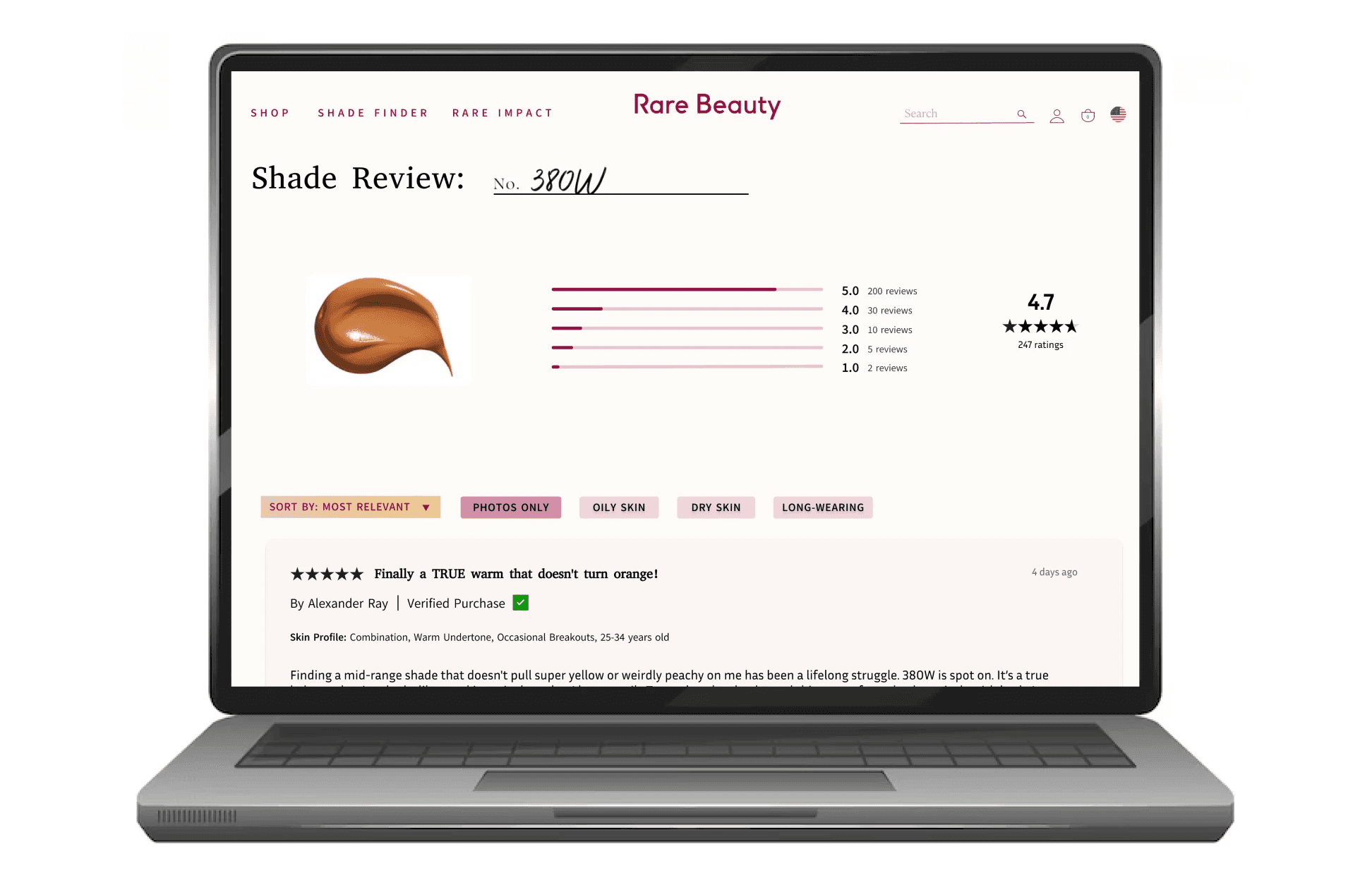
We also had a quiz for first time makeup shoppers or others who were still unsure about their match to guide them through skin depth and undertone education. We also created a results page that would lead to the community validation page about each shade if users still felt unsure. This page allowed users to see real user photos filtered by skin type, shade group, and quotes from people which would further build trust encouraging people to buy the product. This works because online shoppers rely heavily on reviews and video demonstrations. Having a page explicitly dedicated to social proof for each shade will make users more confident in their purchases. This in turn helps users feel included in a community: something Rare Beauty centers their brand around.

Shows the review page when clicking view more reviews on the previous image's page. This dives further into what the community says about the shade.

Recreated product page to integrate our virtual services with "See What People Say About The Shade" and "Need Help? FIND YOUR SHADE." On the top right we also created badges based on community reviews.
Outcome and Testing
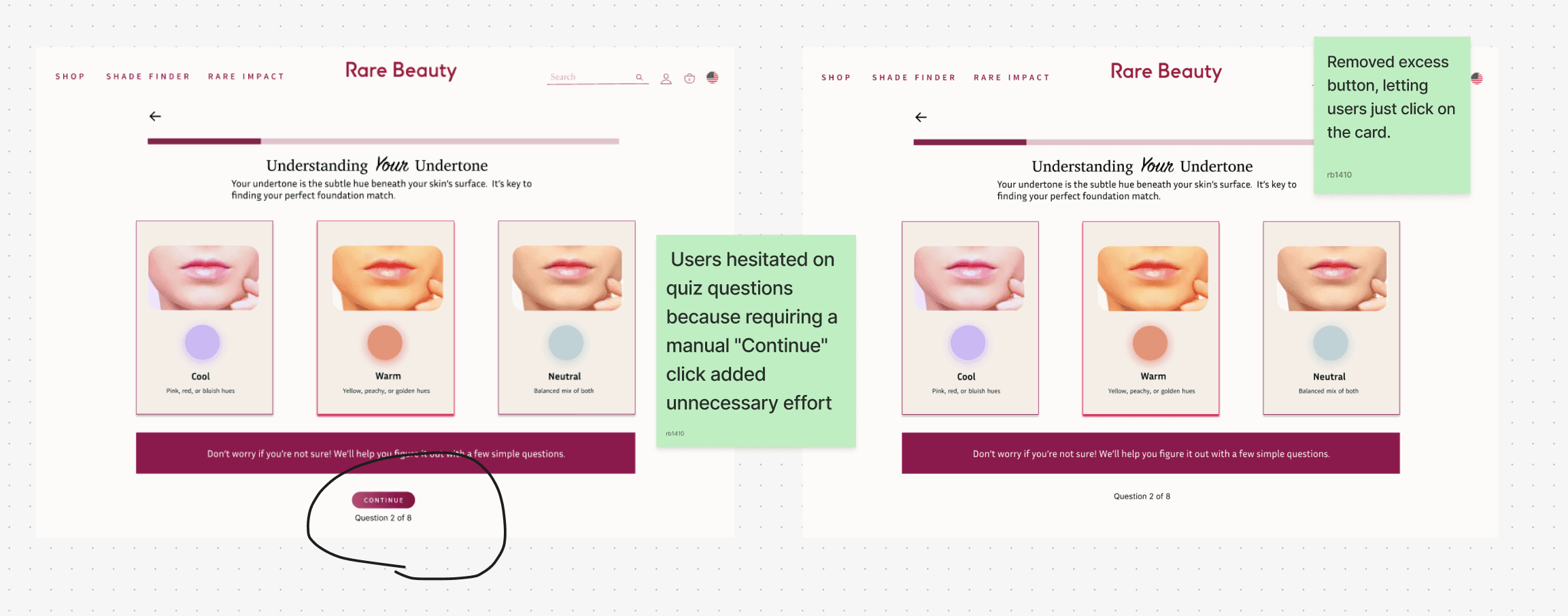
We were able to build a full prototype addressing the problems of our user persona shown earlier, using 13 detailed survey responses. At the end, when we created the prototype, we also tested this product informally with 5 regular makeup users. While they showed great enthusiasm about the new design hailing the simplicity, I noticed a couple users were tripped up by the UI design. Specifically, one user was answering questions in the quiz and didn’t realize she had to click continue to keep moving. This allowed me to see that the continue button might be a little bit redundant so we removed it. If I had time I would go back and refine certain UI choices to make it seem less confusing for users.

The image on the right shows before where the continue button felt redundant, so we removed them out of most of the questions.
Ultimately, the impact I had was that I came up with the idea of the dupe search finder and the community validation page. Seeing the community validation page come to real life helped me to see its value and refine it. The next steps we took was to test it as a full prototype. We noticed that we needed more screens to introduce the homepage with two user flows. We recreated the homepage of the website and product page flow as if a user were going to search up a foundation shade and then added the option to find the shade with our new tools.
Lessons Learned
From this experience, I have learned that research to design is not a linear path. During the project my approach was to just check off a checklist of things to do (do research first then design). While having a checklist and timeline was very helpful, we discovered new user feedback and technical limits (AR/VR) features along the way. Putting the product in front of users made me gain more research insights and allowed for more new discoveries in terms of how the design can be improved. While we did not have time to formally test and iterate, I know for next time I would prioritize allocating time for changing the design after putting the prototype in front of people.