🗓️
2026
Improving Habit Consistency in Meditation Practice app through Progress and Reflection
As the sole designer collaborating with a team of researchers, I created a design iteration for Daily Compassion App featuring data visualization and habit tracking features to improve long-term retention.

Project Overview
Role: Solo Designer
Duration: 3 months
Tools: Figma, Qualtrics Survey, Rutgers Box
Team: 8 researchers, 1 designer
Form: Web App
Background
This project was for my lab director and principal investigator in the Rutger’s Compassion and Well-Being lab. The team of 8 researchers who were developing Daily Compassion which was an app that cultivated compassion through loving-kindness meditation and sending out well-wishes. I undertook this project as a means to conduct research through design to gain greater insight into problems that users were facing. In addition, I wanted to understand the aesthetic and feature direction that the team wanted to take to inform a future direction.
Problem
The problem was retention as 99% percent of the 400 people during the clinical trials who were using the app after the clinical trial had dropped off within 30 days. This app had no long-term users even though this app was targeted towards anyone of any age, even though users saw value in the app. The problem was the way the meditation was delivered, specifically the awkward user flow and high friction UI. This gap between high perceived utility and poor usability led to lukewarm user sentiment and total drop-off over time.
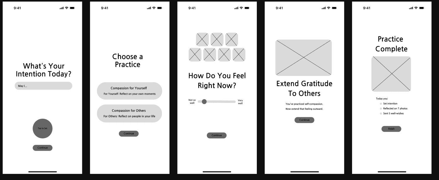
The new layout for the practice sequence to make it more user friendly by provided simple steps.
My role was to propose designs to a multidisciplinary team to improve long-term engagement. I was able to keep the clinically backed meditations within the app, while improving the UI flow through prototyping solutions that utilized data analytics and visualization.
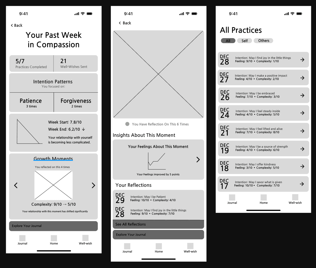
This is the journal tab layout initially conceptualized. The left most is the past week insights, the center wireframe was when clicking on a image journal to extract insights when practicing with that image in loving-kindness meditation, and the last image is all practices list.
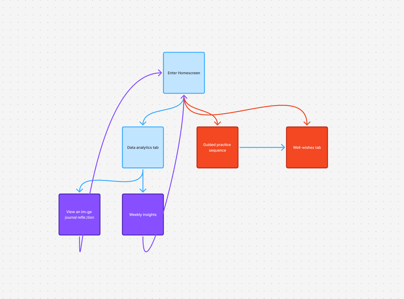
User flow for the app: guided practice or data analytics. This created a feedback loop for practices instead of saving no data, giving more insights to the users.
Insights from Research
The team of researchers finished off a big clinical trial with 400 users to evaluate the usability and value of the Daily Compassion app using a quantitative acceptability survey for the app with one qualitative open feedback question. While almost everyone agreed that this app had value, 33% of users felt the app was “very effortful,” with almost every user noting it was at least “a little effortful.” One user noted in the open-ended feedback, “The app was very repetitive… Opportunities to express why I was feeling/thinking about something would be valuable too. Maybe include /build in some journaling capabilities. So I could go back and see what might have been happening on a particular day that made me feel a particular feeling or why I was having particular thoughts. The app has a LOT of potential but needs to be more dynamic and able to engage with the user.” Participants specifically requested journaling capabilities and statistical feedback to help them connect their daily exercises to tangible improvements.
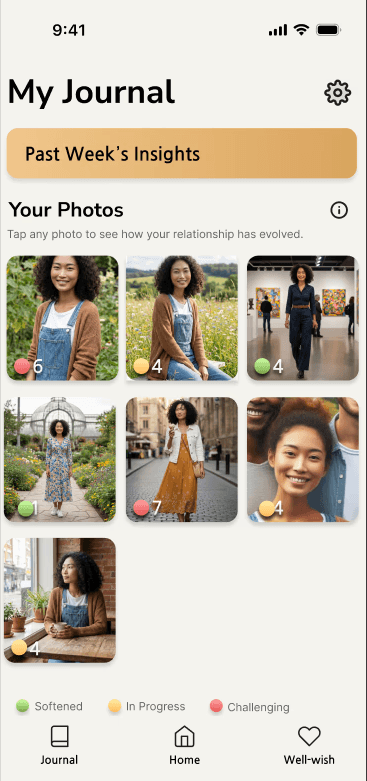
This is the journal home tab with the past week insight card and image gallery of practice photos.
After recognizing the primary problem, I did competitive analysis across other apps such as Insight Timer, Calm, and Headspace to gain insight into why their features encouraged long-term engagement. I saw that the layout of Insight Timer in particular to be very clean and straightforward to use while featuring a lot of social engagement, meditation sequences, and habit tracking features all that successfully pull users to use the app over the long-term. This directly informed the way the home screen and user flow was designed. In addition I looked at wearable trackers and how they collected data to perform analysis into clear metric markers which informed the data analytics features. These sentiments led me to explore analytics and habit-tracking to make the app more responsive and engaging throughout their period of usage.
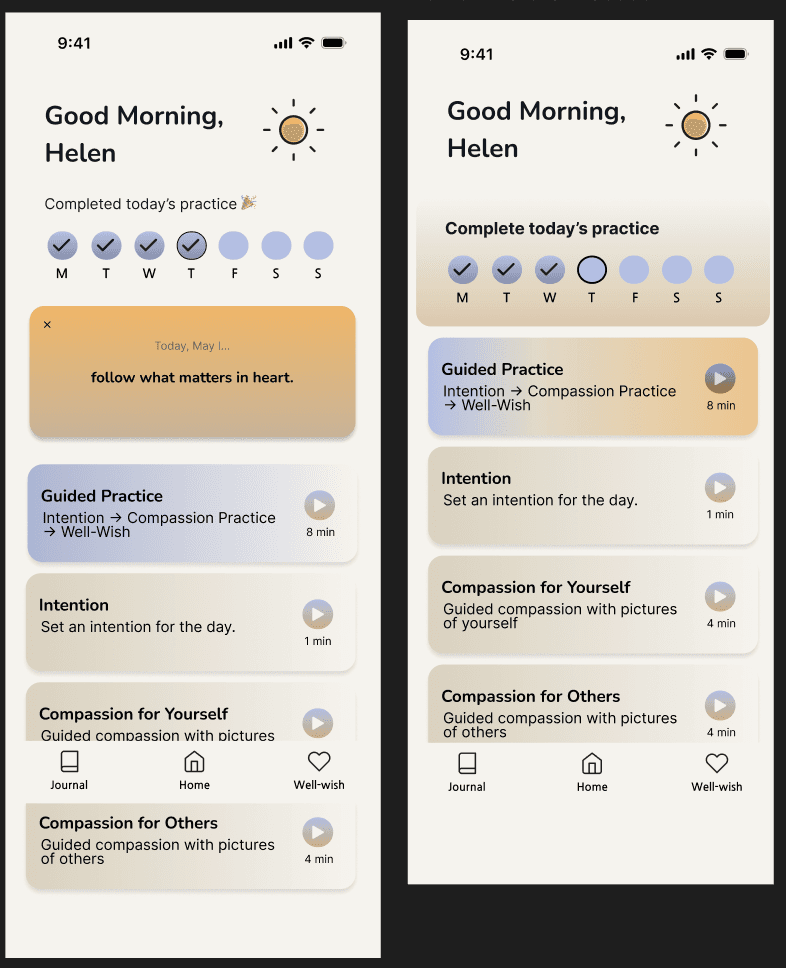
Before and after state based on whether a practice was done or not.
I went on to synthesize results into a problem and create a redesign. There were many ideas from changing the practice flow to changing UI to making a gamified experience. The problem with the gamified experience is that since this was catered toward older users it might add more friction rather than make it more fun. Ultimately, I make the analytics and habit tracking feature central as a solution to the retention problem. I did change the UI to make the app more accessible since black text against white screen was recommended by WCAG guidelines. I brainstormed on paper and the low-fidelity solution to understand the user flow and structure of the new features. I then made the final design in high-fidelity to create a more accessible UI, while maintaining the core app color scheme. I did not have access to users to interview at this point so I held held stakeholder interviews after a high-fidelity prototype was created.
Solution
The solution was to improve the flow and experience of the app by adding a guided home screen to solve the problem of a high friction UI and to create a data visualization feature so users can keep track of their compassion journey. This meant the journey would be: Home Screen -> Practice Self-Compassion or With Other People You Knew -> Extend to Others -> Practice gets recorded and can be viewed in the journal tab. The addition of the Home Screen was to remove decision fatigue by having Guided Practice as the primary option and giving a choice for other options as well if they wanted to do one short thing. The tracker on top is meant to encourage behavior change so that people build the habit of practicing compassion and providing the satisfaction of checking off a goal for each day.
The second feature was a Journal Tab where users can look at reflections based on the pictures they practiced with. The researchers had the practices organized in a way where users uploaded photos that they performed a loving-kindness meditation where they also report how they feel post-practice. All of this data would be recorded and users can refer to their relationship with the photos within the journal tab. Within each photo you can track your feelings over time and also access data from previous practices. There is also an insights card that lets you reflect on your past week in Compassion. All of this is meant to resolve the problem of removing friction and making the app feel not less effortful (since meditation is effort), but feel more rewarding.
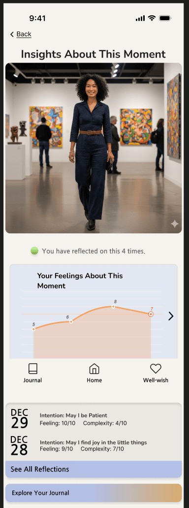
This is the insight about each image in the journal tab.
Testing and Feedback
I ran informal testing with two people that worked within the lab to test its usability and they gave me valuable feedback about how it can be improved. While they appreciated the innovation, they felt that the photo gallery might not be simple for older users to use. In the future I would maybe explore data organization by calendar or date rather than photos. Since the lab did not opt to adopt the proposed redesign due to technical limitations and conflicts with clinical protocols, post-launch retention metrics could not be gathered. However, the outcome of this process was clearer feedback on the direction the developers wanted to head with the app.
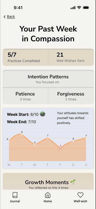
This is the past week in compassion insight card
Besides the UI itself, my biggest impact was learning to bridge the gap between clinical research and user experience. Working with researchers who were developing app created a communication gap because our professions had different vocabularies and approaches to creating designs. By using the initial prototype rejection as a diagnostic and feedback tool, I helped the lab uncover design constraints in the language of their research and recognize how UI friction threatened retention and the validity of their scientific findings.
Lessoned Learned
This initial concept revealed a lot about the limitations working with researchers had. First is that they have an outsourced developer in an international country so there are limitations in what suggestions I can currently make. The app was developed to adhere to strict clinical protocol and by researchers that deeply care about evidence. I could not just say that the design was bad, working in this team challenged me to drive further into researching why the design was bad and be able to articulate that. I know for future suggestions, I have to learn patience, meet them where they are, and do more in terms of introducing them to the design side of delivering these interventions. Ialso really appreciated how the researchers pushed me on my designs, signalling to me that I should really learn to back design choices with tangible sources and user research. Moving forward, I will take this feedback to do more rigorous user testing and interviews to specifically solve the problem with my designs.